Why was insure.az redesigned?
Although there was a specific user base utilizing the insure.az platform, the company was unable to reach its desired user audience. Users complained that the design was very outdated. Additionally, there were issues experienced when using certain services on the platform. For these reasons, İnsure.az was redesigned.
Research process:
Before starting the research process for the insure.az platform, I tested the functionalities of the current platform as a user to identify where the problems were and to gain a better understanding of the platform. I documented the issues I encountered after using the platform.
Since the current platform is integrated with both Google Analytics and Yandex Metrica tools, I decided to use quantitative research methods, as I had access to user data. Additionally, having tested the platform as a user, I could easily determine whether other users faced the same issues I did.
I monitored user behavior using both analytics tools, analyzing data such as which devices were used for access, which demographic groups accessed the platform the most, which services were most frequently used, which pages received the most visits, where users clicked the most, how long they spent on specific pages, heat map analysis, user records on the platform, and more. Through all these analyses, I identified users' pain points and considered each one in the new design.
Discussions with insure.az employees:
After analyzing user behavior with the analytics tools, I held a meeting with the company employees to clarify their business objectives, needs, and other relevant information. We discussed ideas such as highlighting advertising banners, which are one of the company's main sources of revenue, and reviewed how users have responded to them to date, as well as the feedback users have provided.
Problems identified as a result of quantitative research and discussions with company employees:
Results of the discussion with company employees:
Company employees expressed concerns that users were experiencing problems in the insurance purchasing section.
They suggested that advertising banners, which are the main source of revenue, should be prominently displayed.
Employees also noted that users complained about the outdated design of the platform.
Results of the quantitative research:
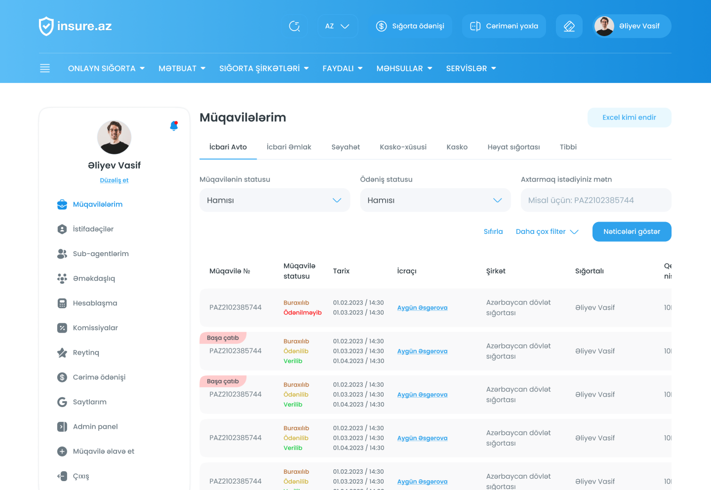
After tracking the users' insurance purchasing process, I identified user drop-offs during the purchase. Additionally, they encountered some errors in the process.
I found that users spent very little time on the platform, and nearly half of the incoming traffic left without utilizing the services.
After reviewing heat maps and click tests, I observed that some areas where users clicked the most were not prominently featured.
Although more users were using the mobile application, I identified visibility issues due to some responsive errors on mobile."
.png)